
In a BRT corridor, the functionality of the system is significantly affected by the station design. A successful BRT project blends together the vehicles, system and station design to achieve an elevated transportation experience – a premier service.
Station design is a defining element for a BRT system because it, along with the BRT vehicles establish the identity of the service. Station design should be considered an investment that will pay dividends in terms of program identity, rider loyalty, comfort, convenience, and safety.
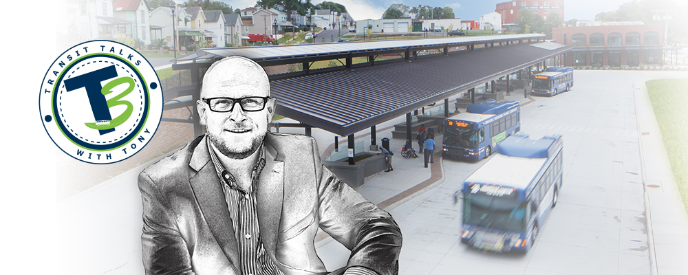
The Greater Richmond Transit Company (GRTC) is a great example of a transit system that was willing to invest the effort and resources needed to improve travel in Richmond, VA through a new BRT system. GRTC Pulse BRT Station Design Project
Wendel learned early on in the design process it was important to GRTC for the stations to be identical so the BRT could be easily and consistently identified from any neighborhood by pedestrians approaching the stations and by riders of local bus routes making connections with the BRT system.
In the end all 26 stations designed for the GRTC BRT corridor incorporate a prominent truss or framework feature. The truss concept was developed with two thoughts in mind:
- Richmond is known as the “river city” and bridges are a huge part of connecting the city from one side of the river to the other, emulated in the truss design.
- It preserved as much open and free platform space as possible by placing the truss as the “back wall” of the station while fully supporting the roof.
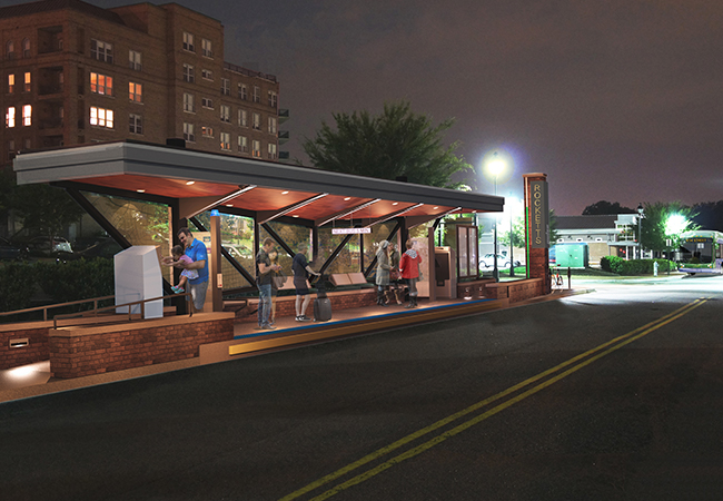
Within a BRT corridor, there can be variations to the design of stations to accommodate the different site locations. This was the case in Richmond. While all the stations look identical, they are a mix of median and curbside locations. Some locations allow for sidewalks behind the station. Other locations require walk-through stations and the varying elevations at each site were addressed to achieve platform-level boarding. Like local bridges, steel was used for the trusses, as well as for the station name pylons featuring a progressively illuminating light feature indicating upcoming bus arrivals.
Creative use of building materials can also pay homage to the local context. The back walls of the stations are treated glass that allow printing on the windscreen panels at each station. Not only is a large map of the BRT route printed directly on glass panels – QR Codes on the glass can be scanned to link riders to website pages with information about the city and neighborhoods surrounding the stations.
Finding the right balance for the overall design of the station addresses the specific operational requirements of the BRT system and the architecture and aesthetic elements speak to the personality and unique qualities of the community it serves. The winning combination is a matter of achieving a balance that seamlessly blends the architectural statement with the function of the station.
Written by:
Tony Kellen
tkellen@wendelcompanies.com
![]()
For Past Transit Talks with Tony Blogs, CLICK HERE